
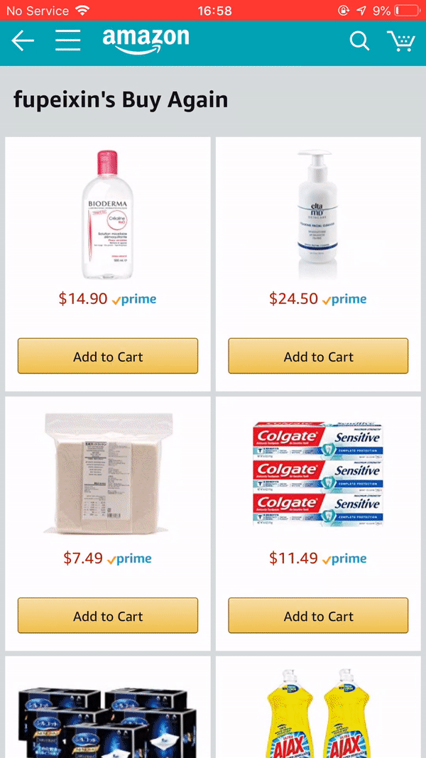
Buy Again V3
Help you at the right moment and context when you wish to reorder with Buy Again.
Buy Again
Amazon Buy Again is a set of products that offer customers easy and quick ways to reorder past purchases. It covered Amazon.com, Fresh and Wholefoods, Amazon business site. The Buy Again landing page and Buy it again recommendations were launched in September 2018 in 18 marketplaces across the world. The product family contributed nearly 3.2% of Amazon WW revenue each year.

My role
From the end of 2018 to the middle of 2020. I was leading the design for Buy Again including Buy Again landing page, the Buy it again widget, Buy Again under Your Order, grocery past purchase experiences, and Business.amazon.com reorder experiences.
I helped to reverse the negative experiment to positive with a series of A/B testings.
Worked with 3 PMs from separate org, 3 SDMs, and 35 developers on a variety of Buy Again products.
What I did
• A/B testing
• Sprint facilitation
• UI, UX, motion design
• Defining design principles
• Data analysis
• Usability study
• Research coordination
• Executive presentations
• Fostering relationships with partners
• Collaborate with cross-function teams
Impact
21.9% annualized profit increase
Ran serval A/B testings on proposed CX. So far, all experiments added up to a 21.9% annualized profit increase.
Million-wise revenue increase for grocery team
Applied the Buy Again design pattern to WholeFoods and Fresh reorder page.
The challenge
• Define customer problems and align product team on proposed design direction.
• Propose design solutions and a series of effective A/B tests.
• Collaborate with up & downstream teams and deal with escalations.
• Work with a tight timeline and help dev teams with edge cases and technical challenges.
Buy Again V2 experiment

Where everything started
Mobile:
+0.8% annual profit
Desktop:
-$0.9% annual profit
The story started with the Buy Again V2 experimentation. When I joined the team, the team was at the end of developing the Buy Again V2. V2 was the new design proposed by its previous designer. The design goal is to keep the customer in the context and do basket building. So click on the item image will open the card underneath (examples above). This will avoid ping pong back and forth between the detail page and the Buy Again page.
The testing result was mixed. Flat on Mobile and negative on desktop. Since the team made so many changes at once, they didn't know which part caused the failure. The experiment result didn’t hit the launch criteria. Leadership warned the team to roll back to V1 and test incrementally. But rolling back to V1 is a non-starter for the team because customers will lose many features.
----------------------------------------------------------------------------------------------
Lesson learned
Don’t make too many changes at once. You won’t know which one causes the failure
----------------------------------------------------------------------------------------------
Quick usability study on Buy Again V2
"Brett, Let’s do a quick usability study and see how we can improve V2 and reverse the testing result"
When the team was running the experiment, I drafted the study outline and invited 8 customers to the open lab to do a moderated study on the V2 Buy Again experience. I asked them to show me how to reorder certain items in their natural shopping path and asked them to shop on Buy Again.

Open lab
Problem 1:
Customers were frustrated by the card auto-scrolling interaction.
Customers try to tap on the item image to close the card.
CX suggestions:
Redefine the interaction and motion for auto-scrolling CX.
Enable customers to close the card by tapping on the card one more time.
Problem 2:
Customers didn’t see important product information show up on Buy Again, and they need to go to the detail page to get more product information.
CX suggestions:
Bring back some of the critical product information to Buy Again.
Problem 3:
The buy Again page is not customers’ destination when it comes to repeat purchases. They will usually start a new search or go to “Your Order.”
CX suggestions:
Build Buy again lite to meet customers at the right moment or context if they wish to repeat purchase items.
Problem 1
• Customers were frustrated by the card auto-scrolling interaction.
• Customers try to tap on the item image to close the card.
Once I observed this issue, I went back to the previous design and quickly prototyped the auto-scroll animation and the new function required. I work with my dev team on the new CX. Both improvements were out of the door as a quick fix.
Mobile V2 before
Mobile V2 after

Problem 2
Customers didn’t see important product information show up on Buy Again, and they need to go to the detail page to get more product information.
Once I found this issue. The first test I proposed was about adding the title to Buy Again to validate the assumption. Another reason was that we could test it relatively quickly and easily. Title is already in our API. There is no need to get sign-off from other teams. Compare with V1, lacking a title is one of the CX differences. It turned out that it was a positive experiment; it also added the confidence of adding more product data to the page.
Mobile:
+1.47% annual profit

Once I validate the approach, then the questions became what other pieces of information we need to bring and why. I compared the two successful experiences on the site. One is the detail page, and one is the search experience trying to find out what other information we need to bring to the Buy Again page. I found that price per unit, coupon, and delivery promise, and scarcity message were critical to the customers.
Comparison between detail page, search and Buy Again.

Received push back from the product manager
PM:
“Coupon drives too little of business impact but requires a lot of dev efforts. Let’s deprioritize it for now.”
Peixin:
“This is a trustbuster if we don’t surface coupon especially we have a high promising button-buy now button. In addition, I checked the old experiment data on the search and detail page. Both drove big business impact by adding coupons. ”
Eventually, I successfully convinced my PM about prioritizing coupons. I owned the process to drive it and launch it.

The major design challenges for design coupon experiences:
• The space is limited, and I need to fit into a lot of text. When it comes to different languages, it gets very long.
• I got escalations from the vendor coupon team when I shared the design with both the coupon vendor and the customer side team. It is a vendor trust buster if we auto-apply the coupon, and we can’t argue with that.
I went back and tried different approaches and design explorations to achieve coupon-clipping manually and constantly sharing and collecting feedback from all related teams. I landed on the final solution to cut the full message and only keep the coupon savings to reduce the message length.
First proposal


Escalations from the vendor coupon team again. Cutting "coupon " from the promotion message is confusing and the design is confusing because customers don't know where to click.
With this feedback, I decided to run a quick usability study and see how this simplified message will impact customer interaction. The result was very positive. 10 out of 11 customers understood the promotion and knew how to apply the coupon. I shared the testing result with the coupon team and they finally signed off on my design.
Usability study on Usertesting.com and data tracking quip doc

Mobile & Desktop:
+1.15% annual profit
Adding coupons to the Buy Again page turned out to be very positive. It launched eventually.

Mobile & Desktop:
+21.94% annual profit
Adding the other three pieces of information ended up with a positive business impact. All experiments were launched on both mobile and desktop.

Fresh & WholeFoods millions-wise revenue increase

Grocery team reached to us and wanted to leverage the Buy Again V3 design pattern for their past purchase page because, in the future, both programs will open doors for each other. So it is better to keep the design consistency. I helped to design their past purchase page. I did some customization for Fresh and WholeFoods past purchase page. It turned out to be a million-wise revenue win for the Grocery team. This inline expansion layout applied to the Buy Again desktop experience later and drove a 3.4% annual profit increase for Buy Again team.
Problem 3
The buy again page is not the customers' destination when it comes to repeat purchases. They will usually start a new search or go to "Your Order"
Step back and view the problem holistically
Before I run to design and ideation, I first went through the customer reorder shopping journey. The goal is to define all the touchpoints we can meet the customer in their reorder shopping journey besides search and your orders.

There are three major opportunity areas.
• Remind - When the customer reaches the purchase frequency, the customer needs to be reminded of what's running low and potentially repurchase the items.
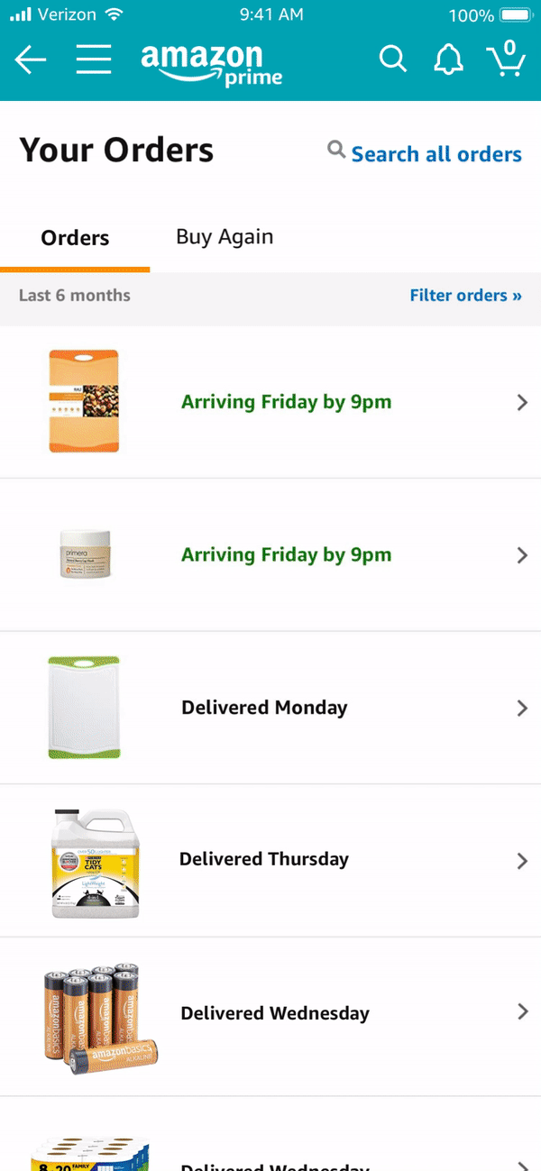
• Close the deal - When the customer misses the reminder or the item doesn't run out at that moment, the customer may come to Amazon to reorder this specific item. The customer may go straight to Your Orders or start a new search to finish the task. These are two contexts where we can meet customers and help with their reorder missions.
• Stock up - This is a special case where the customer might want to stock up on the frequently reordered products when there is a price drop or promotion before or post repurchase cycle.
Come up with Buy Again Lite card framework
Once I have done with defining the context to meet customer. Then the question became, "What we need to show to help customers reorder the items?"
I used the Buy Again information hierarchy I created for Buy Again V3 as a reference and come up with 6 major card types that could satisfy most of the use cases I defined earlier. The goal of this set of cards is to provide a foundation. Partner teams can leverage their research and learnings to adapt to the context if they want to own the experience on their page completely.
Buy it again card framework

Reminder
Pat bought the cat litter every three months. It has been three months since Pat last purchased it. Today, he is checking his email/notification…


Close the deal
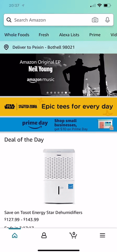
Pat purchased cat litter three months ago. He comes to Amazon to repurchase it. He starts by searching the cat litter and see if he can find the product.
Close the deal
Pat purchased cat litter three months ago. He comes to Amazon to repurchase it again. He usually starts by going to his order history and find the product.
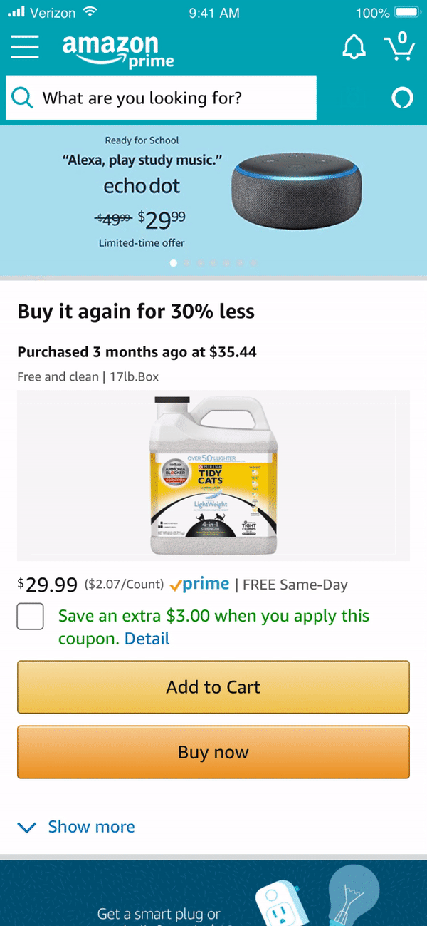
Stock up
Pat bought the cat litter every three months. But, today, Pat comes to Amazon to buy shampoo. He opens the Amazon app and searches for shampoo. At the same time, there is a price drop for cat litter.
Buy it again to YO redirect

Buy it again lite in YO
Buy it again lite in Search

Buy Again to Your Orders redirect: +10.76% annual profit
Few take-aways:
• Don’t make too many changes at once; otherwise, we don't know which one causes the failure.
• Failure isn't a bad thing. Testing is a way to validate assumptions, and it can be ups and downs. It is good that we know things can't work out earlier and we will have targets to work on later. Just to make sure we are making two-way door decisions. Then we are good.
• Push back when customer's needs are compromised for the sake of efficiency.
• Dive deep and understand the product end to end and how it fits within the Amazon ecosystem. This will help to think about problems and solutions holistically and sustainably.
• Collaborative, open-minded, and transparent when it comes to escalation. Everyone involved in an escalation wishes things to work. We need to find a balanced solution that everyone aligned including being transparent with the process, open to different opinions, and finding convincing evidence.