Kids+ Mobile Reader
Redesigning Amazon Kids+ mobile reading experiences

Amazon Kids+
Amazon Kids+ is an all-in-one app for entertainment, fun, and educational content. Kids will have unlimited access to over 10,000 children’s movies, TV shows, books, and games tailored for children 3 – 12 years old. The mobile reader experiences foster their love of reading with thousands of children’s books, audiobooks, stories, and series.

TL;DR
My role
I designed the entire mobile reader experiences (2021 April - October). I mainly with PM, SDM on the scope of work, timeline, and deliverables for P0, P1, and P2. Proposed new mobile reader experiences and the new design helped to lift the app reviews and get design sign-off by all country managers and the legal team. Ran multiple comprehension studies to iterate and improve the core UI and advocate features for kids through study insights.
The ask
Kids+ mobile app is the window for parents to have a peak view of Kids+ subscription services and the education aspect of the app is the most appealing feature compared to the other competitors on the market. But parents were disappointed by the poor reader CX and moved to other platforms. It is a real pain for the business and we got so many negative reviews regarding the mobile reader experiences.
The solve
My team got together and redesigned the mobile reader experiences for kids age 5-12.
Impact
-
Increased the Kids+ subscription coming through mobile post launch.
-
Lift Kids+ App and Android store reviews.
Challenge
-
Prioritize and optimize the reading experiences for kids aged 5-12.
-
Ran in-person study with kids on the UI comprehension test in the short time frame.
-
Deal with downstream use cases, edge cases, and technical limitations.
-
Consider localization for 4 other locals
Where everything starts


When I joined the team, this project had a sense of urgency. The team lack of UX support for quite a long time. So I switch my focus from parent experiences to a new area - Kids+ mobile reading experiences.
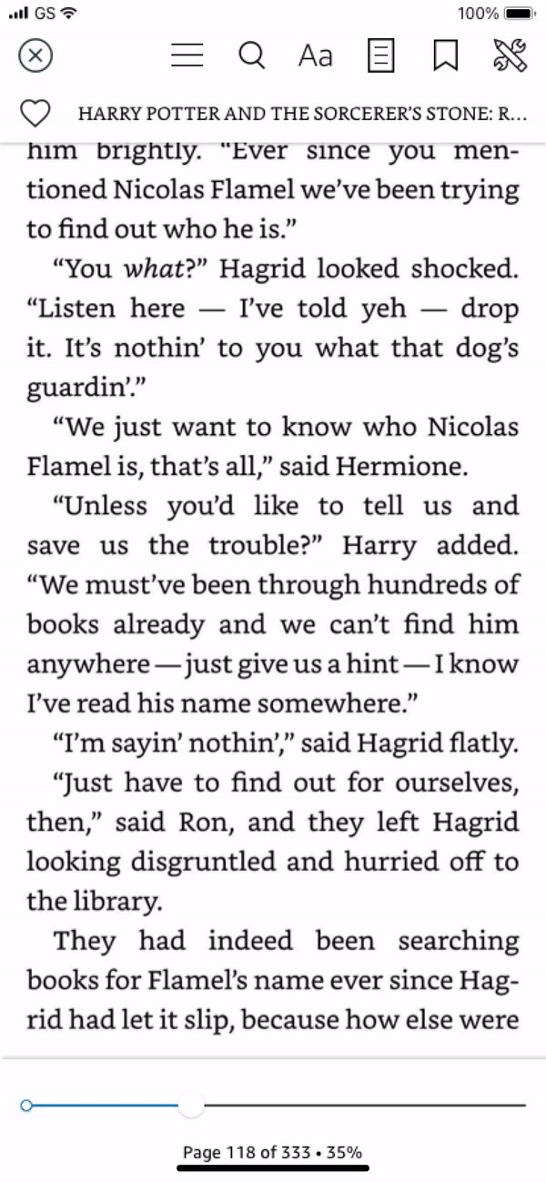
After the existing mobile reader was released, 25% of our customer reviews mentioned the keyword “Book,” and the average rating for these reviews is 1.9 out of 5 stars, mainly due to the CX specifically; top complaints include lack of bookmarking and lack of reliable zoom capabilities, etc. The team previously consider to reuse the kindle reader design but the eng team will have to build everything from the ground up. Why don't we treat it as an opportunity to advocate for our specific customers - kids and parents to create a simple, convenient, enjoyable reading experience.
Design goals
-
Address the negative feedback about the reader CX, expected to raise review scores on both Android and IOS, and thereby indirectly lead to subscription growth.
-
Design the experiences for kids aged 5-12.
-
Keep reader design consistent across the Amazon ecosystem.
-
Get design sign-off by all stakeholders and hand over design in two months.
Previous Kids+ mobile reader VS Kindle adult mobile reader
Kids+ mobile reader
Kindle adult mobile reader
Unpack the live Kindle experiences and align on product road map
When the Kids edition table went out, it used the same structure from the Kindle app. So everything Kindle provides shows the same on Kids Edition Tablet. But when the tablet team launched the design, there was no study explicitly conducted for tablet reading experiences. We only know what features have better clicks on the tablet. Only copying and pasting everything on mobile won’t work because the Kindle experience is way more advanced for kids. I worked with my PM to list all features we need to introduce to the mobile reader and keep parity with the Kindle and Kids Edition Tablet.


Kindle

Kids Edition Tablet
Core reading features:
• Page turn
• Pinch & Zoom on image
• Save reading progress
• Change font size
• Search keywords
• Bookmark & Notebook
• Read vertically
Bring kids convenience:
• Heart to save (New)
• Go to the beginning (New)
• Back to the previous page
• Autosave location
• Table of content
Update to kids friendly UI
• Close button
• Overflow icon
• Bookmark & Notebook
• Lock orientation
The core features kids use most often will be prioritized for earlier release. Also, consult with the dev team on the scope of work to ensure we can release on time.
-
P0 focusing on the core, most often used features like page turn, pinch and zoom, change font size, hamburger menu, save location, etc.
-
P1 focusing on reading convenience and less tech-heavy but is being requested a lot from customers like sync across devices, Bookmark & Notebook guided view for manga books, back to, etc.
-
P2 focusing on advanced features like Search keywords, highlight content, dictionary, integration with Alexa, etc.
NEW mobile reader
Once I locked down the P0 requirements, I started with a core reader chrome design. The structure dev must build first and sign off by all stakeholders as soon as possible. The design covered most of the core features we plan to support across P0, P1, and P2. It is essential to design toward the long-term rather than only considering P0 requirements.
Core top chrome
Core bottom chrome

Device orientation and reflow-able format

Pinch & Zoom

Jump chapter
Through the hamburger menu, kids can jump into different chapters, go to the beginning of the book or read the details.

Change the text sizes
Provide a wide range of font sizes for kids to choose from. Adjust the text size when it comes to the chapter book. This option won’t show up in the image book.
Bookmark & Notebook
Bookmark the page and revisit in the future through notebook.


Read by vertical scrolling
For chapter books, kids might like to read through vertical scrolling, and they can adjust it through the tools.
Localize the experiences post the stakeholder review

Localize the text size variations for Japanese
"Aa" is the most often used symbol representing the text size for US customers, but the symbol should be localized using JP character for JP customers. The “あ” means the same in JP, but I only use one letter on the icon since JP doesn’t have capital and small letters.
Customize text size icons for Japanese

Choose the typeface for book rendering and in book UI
I encountered many problems when I chose the in-book UI and book rendering font. I reached out to the Kindle and JP design teams and was told that the UD Shin Go is the right font for the in-book UI, and the book rendering should be TBMincho. But when I worked with my dev team to see from the code, the in-book UI is TBGothic, but the JP country manager wanted me to stick with UD Shin Go. I researched the JP fonts and how each font is used. I also reached out to the JP shopping design team for a consultation. I found that the TBGothic is smaller than the UD Shin Go in the same text size. It is more consistent with Amazon Ember in terms of the text height and width. The TBGothis has better spacing compared to UD Shin Go. Also, for the JP design team, a smaller text size works better than a large text size. I convinced the JP manager to use TBGothic just like the Kindle does.


Kids comprehension study: age 7-12
With limited time, nobody expected to run any study before release. But these new features and the new UI elements I introduced to the page haven’t been tested with kids previously. So there is a risk if we roll out without testing and refinement. So I worked with an external agency to run the in-person comprehension test with older kids. The goal is to understand if kids understand the new features and UI elements.
General insights
• Older kids respond to the icons better than younger kids.
• Kids have more experience reading on digital devices and have better recognition of the UI elements.

Insight 1:
• Kids always misread the tools icon.
Tweak the icon design and make it more familiar or straightforward for kids to understand.
• Kids misread the black heart as they hate the book.
Bring the original red color to the heart icon once selected.
• Kids don’t know bookmark for a specific page and don’t make the connection between bookmark and notebook.
Show the bookmark icon on the specific page and keep the color consistent. Use transition and color to help kids connect the bookmark and notebook.

Insight 2:
Kids better understand the bookmark and table of content over device rotation.
Prioritize features based on kids’ usage rather than the dev efforts with respect to the project timeline.
During the research study, I found that kids generally don’t familiar with device orientation settings. But they were delighted to see that they can bookmark a page and see it being selected on the core top chrome. I think we should prioritize the features that have better comprehension by kids. So if kids don’t understand the feature, let’s drop it for P0 and focus on the parts that kids know better. Also, the bookmark was requested heavily on app store reviews.
When the dev team was close to the end of the implementation, they ran into many dependency issues from other teams. These dependencies force the team to push the timeline to two months later. I brought up the bookmarked topic to the group and prioritized it to P0 with the additional time left.

Insight 3:
In general, kids have difficulties understanding the icons and features newly introduced to the new reader.
Provide tutorials to help kids and parents to understand the icons and the features.
Design goals for the tutorial
• Let the visual speaks rather than the text
• Optimize for 5-8 years old kids
• Fewer steps and easy to get through
• Optimize the features that kids don’t have good comprehension
What features need additional education?
Adjust the text size
Bookmark and Notebook
Lock the device orientation
Switch to continuous view
I did a lot of explorations about the visual style and the possible animations to provide better comprehension for kids. I consulted the Kids+ brand designer on the style guide and brand guide. Involved the Kids+ brand color and branding-specific lava shape in keeping the visual consistency across the entire Kids+ experience.

Delivery the mocks and redlines to Dev team
What’s interesting about this project is making my design compatible with all types of devices, including mobile phones and tablets for Android and IOS. I need to design towards 3 breakpoints in code to cover the 4 major viewport sizes.:
SM < 414 < = MED < 678 < = LRG <800 < = XL

Join dev daily standup and helped with edge cases
When it comes to design hand-off, I typically start to join the daily standup when implementation begins. I can stay on the same page during the implementation stage and ensure they get design support when technical limitations and edge cases arise.
Storage problem
This is the first problem I discovered. Compared to storage size, the mobile experience has a lot of limitations, especially since parents use their mobile devices daily. So it is expected that customers might run into storage problems. With limited time, I need to develop a simple solution so parents can easily remove the downloads and free up their space. So I created this short-term solution that can free the space with an easy one tap, but a long-term solution will provide ways to delete content by size or content type.


Book licence limites
The book license limits are very different depending on the contract Amazon Kids+ with each author. Usually, the license limit is between 4-12+. If Kids download from many other devices, they might run into the problem of downloading the book from the mobile device. So I need to consider the error message to tell kids or parents to remove the download from other devices.
Page turn too fast or fast swipping
For large-size books, the system won’t download the entire book cause it will take longer, and customers need to wait for the download to complete. So for these types of books, it only downloads for 30% and continuously downloads and renders the text as kids read more. But there is a possibility that kids swipe too fast, and the download can’t catch up with speed. I designed the alert message to notify the loading situation.

Round corner device and cutting notch
When it comes to all types of devices, the round cornor and cutting notch will affect the top and bottom chrome design. Core functions might get cut off. I worked with dev team to specify the design for each unique device to make sure all core features won’t be covered or cut off.

Making it real
There are a lot of dependencies and challenges when implementing the design. Kudos to my excellent development team for making it real and helping me define so many edge cases. The design was launched around April 2021.
The new design has driven a 1.5% increase in Kids+ subscriptions.
Old Kids+ mobile reader
New Kids+ mobile reader

Few take-aways:
• Customer anecdotes worth a thousand words. Collecting quantitative data will help validate the design and convince the team on what changes need to be made to be more successful.
• For a project like this, the significant challenges won’t just come from convincing the stakeholders or driving design alignment. Sometimes, it might come from the implementation. Be proactive and collaborative when working with developers and earn trust by helping them overcome all the technical difficulties.
• Working with kids is a lot of fun cause they are the most collaborative, open-minded, and honest group of people. You will learn a ton by observing what they do and hearing what they say.
• Designing for kids requires a lot of thinking and legal review cause we might touch on sensitive topics when coming up with new ideas. Just to remember, we provide tools rather than teaching parents about parenthood.